Why not own all of the S&P 500? Just $SPY ’til you die? If we’re going to take this approach, why not just own the NASDAQ? It’s done better than the S&P. Why not just own the “Mag Seven” that carry both indexes? Why not use a DeLorean and Grays Sports Almanac to build your wealth?
The worst thing we can do as investors is second-guess why we did not pick Google, Apple, Nvidia, Microsoft, etc. It’s so easy for investors to experience FOMO. It is so easy to look at the best performing stocks and indexes and second guess yourself after the fact.
FOMO is a trap
It used to be that you’d maybe look at the best-performing stocks and say, “wish I had all of my money in those,” but you’re either prudent or your investment advisor is, and you’re diversified across many stocks among various indexes.
Now, people might ask, “Why don’t I have all my money in the index? It’s diversified, right?” That question requires a more complex answer. The S&P 500 Index might have 500 companies, but its returns are increasingly the result of only a handful of companies. This isn’t too abnormal, but all of those companies are big-tech. The S&P 500 Index is essentially a singular big-tech investment now.
Diversification is lame, and that’s the point
Diversification is seemingly becoming costly, even when our portfolios perform exceptionally well by historical standards. If you only held the best-performing stocks, you’d crush the index and prove you’re the best investor ever. You could live in the Virgin Islands and explore the world on your ocean-faring yacht. It’s so easy!
It’s easy to abandon a diversified investment approach and concentrate your portfolio on what seems to be performing the best. Financial media plays a significant role in this, often promoting the idea of chasing returns. Staying disciplined is more challenging now than ever.
Free advice is often the worst advice
These days, we all have access to too much ‘free’ financial information through financial news or social media finance gurus. They always highlight the success (real or not) of others. We always see the wins, rarely the losses. Unless a portfolio is highly concentrated and only holds winners, it is all but guaranteed to have some underperforming investments. If it’s highly concentrated, you had better be right.
However, financial advisors don’t recommend concentrated portfolios. They recommend diversification. Financial advisors aren’t trying to make their clients rich beyond their wildest dreams. They are trying to ensure their clients have positive investment experiences. To do that, advisors diversify. That means giving up the chance of landing that life-changing moonshot investment to achieve investment success.
Record Returns
Since 2010, the S&P 500 index has delivered an average annual return of 13.3%, significantly outperforming international indices like the MSCI EAFE Index (5.9% annual return) and the MSCI Emerging Markets Index (3.2% annual return).
The S&P 500 has performed well over the past five years. As of mid-2024, its five-year return is approximately 85.62% (YCharts). This is significantly higher than the long-term historical average of about 45.58% for a five-year period (YCharts).
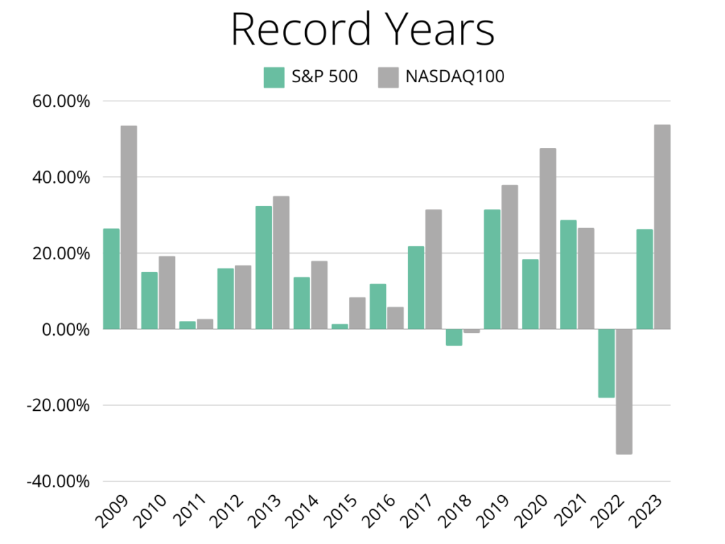
History also shows us that long periods of over/underperformance are pretty standard. Banking on continued outperformance might seem like a sure bet, but we have seen such bets fail time and time again.
The Illusion of Diversification
Just a handful of stocks drive the entire index. The S&P 500 and NASDAQ 100 indexes are both market-cap-weighted, meaning that the most prominent companies comprise the most significant proportion of the index. The S&P 500 is technically more diverse, representing many industries, while the NASDAQ 100 is more tech-oriented.
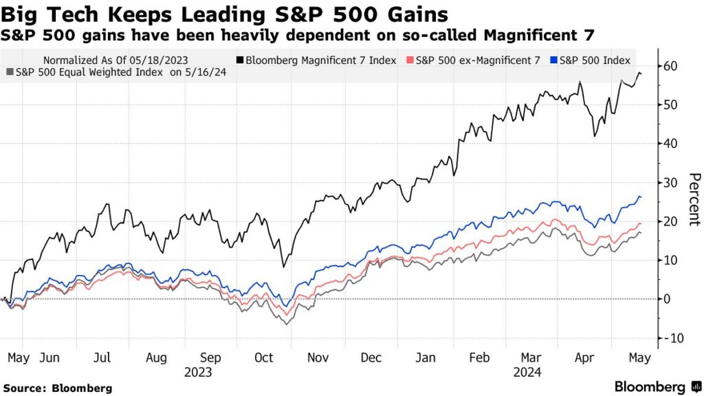
One could argue that the S&P 500 is broadly based, unlike the tech-heavy NASDAQ, which includes utilities, healthcare companies, banks, etc. The S&P 500 looks more like a big tech index than anything else because of the rise in tech over the past fifteen years—Nvidia is responsible for over a third of the gains in the index this year.
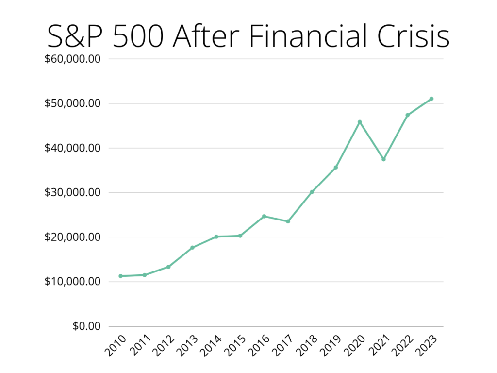
The problem with investing in all one index or a highly concentrated portfolio is that you will experience significant and perhaps long periods of underperformance at some point. It’s bound to happen. That can be problematic when you have a relatively limited time to build and maintain wealth.
The Risks of Concentration
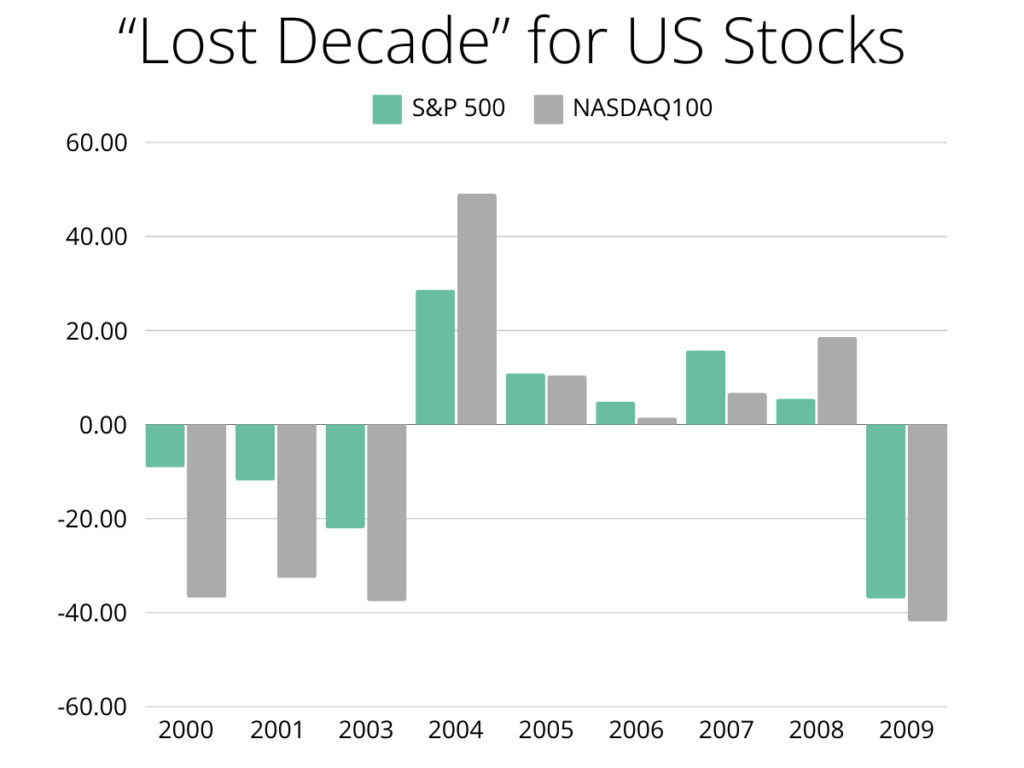
It wasn’t that long ago (longer than anyone reading this would like to admit) that each index suffered a long period of underperformance. After the Tech Bubble and Global Financial Crisis, the S&P 500 and NASDAQ 100 suffered. The S&P 500 went through a “lost decade,” while the NASDAQ took about 15 years to recover from the dot-com bust.
From Goldman Sachs:
“The Nasdaq index rose 86% in 1999 alone, and peaked on March 10, 2000, at 5,048 units. The mega-merger of AOL with TimeWarner seemed to validate investors’ expectations about the “new economy.” Then the bubble imploded. As the value of tech stocks plummeted, cash-strapped internet startups became worthless in months and collapsed. The market for new IPOs froze. On October 4, 2002, the Nasdaq index fell to 1,139.90 units, a fall of 77% from its peak.”
It would take the NASDAQ 15 years to reach its previous highs. If you had invested in the NASDAQ in early 2000, it would have taken you over a decade to regain your initial investment. Nobody’s retirement survives that.
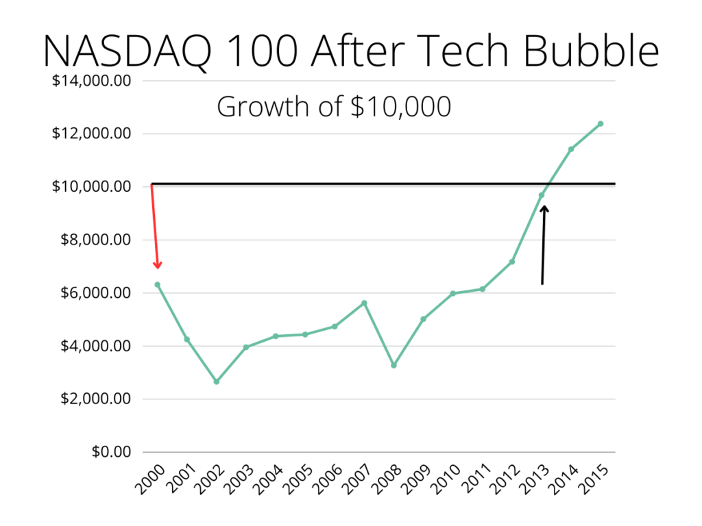
Long periods of relative outperformance and underperformance are fairly common for indexes. Looking closer, you can see that only a couple of extremely bad years can ruin a decade-plus of wealth-building. Being 100% invested in US stocks in the 2000s pushed retirement savers to delay or exit retirement. Nobody wants that.
History Is an Imperfect Guide
History shows us that certain markets, indexes, and strategies tend to outperform or trend over a long time. This phenomenon isn’t new. The investment outperformance of US megacorporations has happened time and time again, but that has not always been the case.
A look at 1980s US vs Japanese stocks
Japan was supposed to overtake the US economy and then the world. There was a lot of mania (hysteria?) around Japan, replacing the US as the dominant global economic powerhouse. This fear permeated politics and pop culture. It also drove the Japanese Nikkei to some insane highs.
Throwing $10,000 into the Japanese stock market in the 80s would mint you a nice return. Even after the meltdown at the end of the decade, you’re still way ahead of the S&P 500.
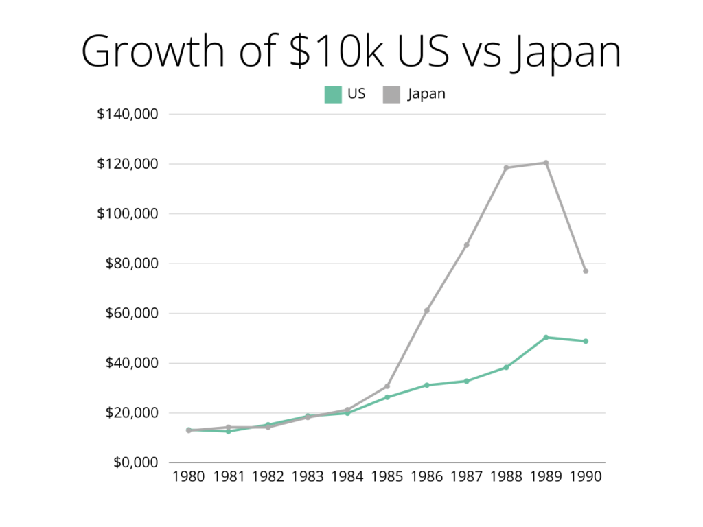
The Nikkei 225 index fell significantly from its peak during the 1990s asset bubble. The index hit a high of approximately 38,915.87 points in December 1989. Following the burst, the Nikkei experienced a dramatic decline, falling to a low of around 7,054.98 points in April 2003. This represents a decline of about 82%, reflecting the severe impact of the economic downturn and the subsequent prolonged period of stagnation in the Japanese economy.
We see the relative outperformance year over year leads to significant outperformance over a decade. Some people thought this would continue forever and that it was inevitable.
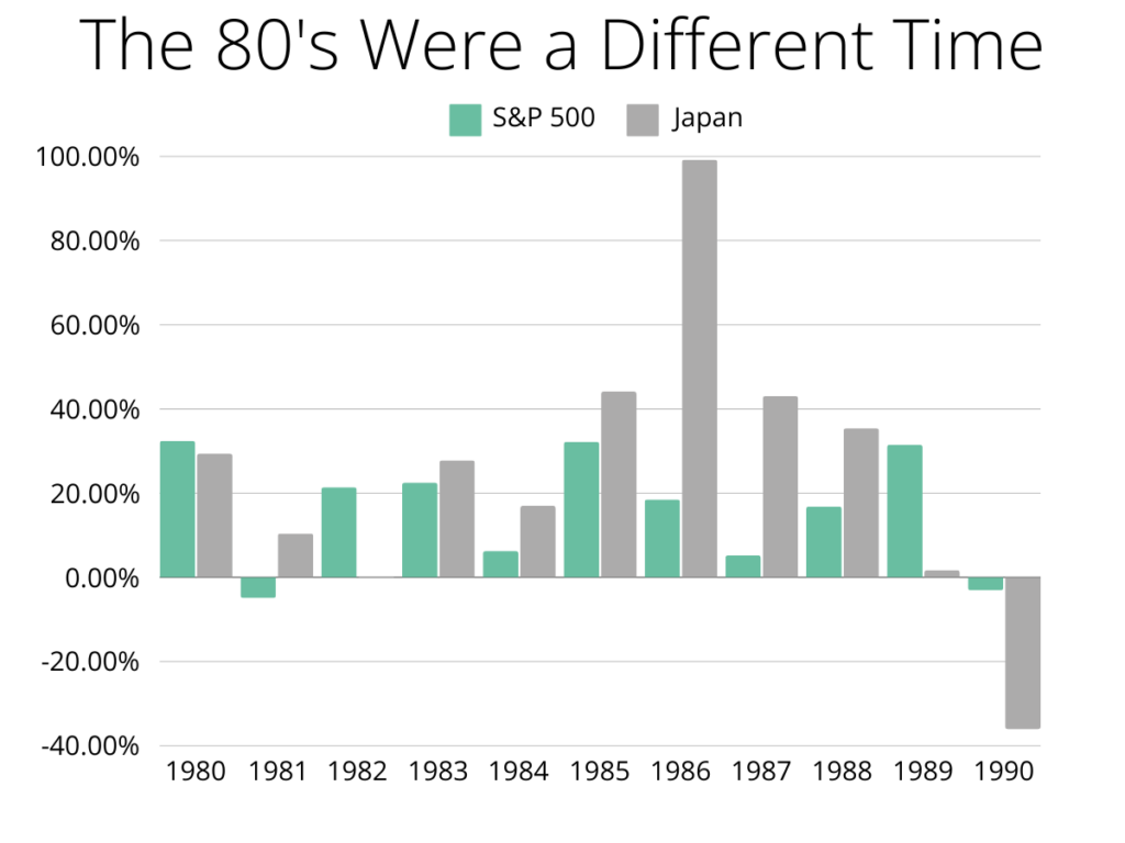
Japan started to face some very difficult economic problems, and its stock market began to reflect that reality. It would take the Nikkei 34 years to recover and reach its previous highs. Markets can trend in either direction for a long time; they don’t always bounce back.
The Argument for Global Diversification
Indexes have a tendency to trend over long periods. Then they don’t. Investors have gotten used to quick rebounds of US stocks in recent(ish) years, but it would be foolish to think that will always be the case. For investment success, you must diversify among various global indexes over decades. It will mean that you will always underperform the best outcome, but it will ensure you don’t experience the worst.

